A mobile app design process consists of several steps to create a great UI (user interface) and UX (user experience). This process includes in-depth ideation, designing to testing with different users. The design is based on extensive research and expert coding skills.
The following steps are included in a phone app interface design process:
- Research
- Ideation
- Identifying the problem
- Designing
- Feedback
- Evaluating the problem
We have compiled a list of best mobile app design practices that you can follow to make sure your app has a stunning design and an amazing UX.
What are Some Popular Mobile App Design Best Practices?
1. Blend Useful and Intuitive Experiences
Don’t make the users confused by adding long sulky steps to complete a task or action. Keep all the menus and actions organised in such a way that users are able to reach the function they want in simple, small steps.
Lessen the burden of users by saving the work and previous steps even when they close the app. You can set a reminder on notifications for them to complete the process.
Make the experience intuitive for users and let them find their way without many interruptions.
2. White space is the king
When an app has more white space, it makes it easy to highlight the major buttons and content in the app. White space, also known as negative space, might be just an empty place, but it lets you know what is there and where you can go.
Using more white space around buttons and CTAs or content where you want attention can be a great idea.
Examples: |
| Apple – with a clear white background |
| Mailchimp |
| Myntra |
3. Cut out the clutter
- Since mobile screens are smaller than desktops and tablets, any unnecessary elements should be removed from mobile apps. The action should be straightforward on the screen.
- Also, multiple actions should be removed from a screen. There should only be a single, primary action on each screen, as needed.
- Providing navigation for detailed pages can reduce the clutter on the screen
Hence, keep the designs simple enough to highlight the important things and remove the content lot. Keeping the application light and easy is one of the vital mobile app design principles.
Some of the best mobile apps for example here can be: |
| Evernote |
| Asos |
| Instacart |
| Starbucks |
4. Simple navigation
Navigation should be visible to the users so they can understand and engage easily. The options should be clear, with helpful icons or text. In some apps, you can also use the search feature to make navigation easy for the users. A few of the best user experience apps are:
Examples: |
| Uber |
| Gmail |
| Duolingo |
| Dribble |
5. The Appearance Speed Matters
Speed is necessary, whether it’s a website or a mobile app. No one wants to wait long for the next content. Hence, keep the app light with compressed images and videos.
Do not fill up the app with useless elements and keep your users engaged while loading the next screen with some animation or micro-interactions.
Get a remarkable UI/UX design for your next app with us
Contact Us6. Use Neumorphism
Neumorphism is a trend that has been used to attract users and build beautiful apps that demand action with pleasing designs. It is an update of Skeuomorphism. With metamorphism, you use gradients and other tactile visual elements that highlight the specific part you would like your user’s attention at.
It relies on monochromatic colors that are specific to the brand colors as well. However, there needs to be a balance between using normal and neomorphic designs.
7. Chatbots
With the increasing demand for live communication by users, chatbots have become a trend and an important part of the user experience. Chatbots provide a chance to build and maintain long-term relationships with potential and existing customers both. They are also helpful in assisting customers when an executive is not available, hence retaining them.
Now, with AI in chatbots, you can enable them with the help of intelligence to fulfill customers’ needs in a better way. Chatbots are something that every user wants on your app whenever they have a question.
Rather than going to the FAQs section by navigation, a chatbot providing them a link or clear answer to their question on the same screen is a time-saver and what the app users prefer.
8. Voice-based Assistants
Google, Siri, and Alexa have become a part of regular use. In the era of voice search, a voice-based assistant can be a bonus point for a great mobile app user experience. While designing the app interface, an option of voice assistant is advisable to be integrated. This will add easy command operations for a user.
9. No Web Experience
While designing an app, keep its UX different from than web because using the same user interfaces on the app does not work for the users.
The design should go with the device’s screen and controls. In a mobile app design, use more buttons than underlined links.
Do not redirect the user to the browser. Try completing all the steps within the app only as redirection to a browser might create a distraction for the user.
Highlight the actions and also guide a user when they are stuck on a page for some time. Make all the instructions seem clear.
10. Personalise the Experience
A personal touch to the app can work so much better for your users. The UI/UX can be personalized with simple techniques such as
- Showing the user name, photo, etc. on the screen
- Giving them the option to personalize their screen with different themes and colours
11. Helpful notifications
Yes, we know that notifications are a part of communication between a user and the app, but when to send notifications is a tricky part to figure out.
The time to send marketing or helpful notifications is important as a user might get frustrated if the notifications are sent frequently and are just for promotion. Let the users navigate through themselves first.
Also, you can ask users if they need any notifications and at what time. You can notice when they open notifications more frequently and send them accordingly at a user’s preferred time as well.
12. Be Consistent
Imagine that there is every element used in a different colour on an app page, the font colour of the menu is different, and the logo and other images are in a different colour. It will look tacky, right?
So, consistency becomes important to make the best app user interface design and maintain the branding and give your app a satisfying look. If all the buttons are in the same colour, a user will easily understand what this colour or design works for. It not only makes the app screen looks aesthetic but also helps users interact with intuition and ease.
Planning to launch a new app? Still, looking for UI/IX designers?
Concetto Labs is the solution
Hire the Best UI/UX designers
5 Apps That Have The Best UI/UX
On the note of talking best UI/UX app design practices, let’s see how different popular apps have applied this in their mobile app and how it has helped them to satisfy their users.
1. Uber – Request a ride
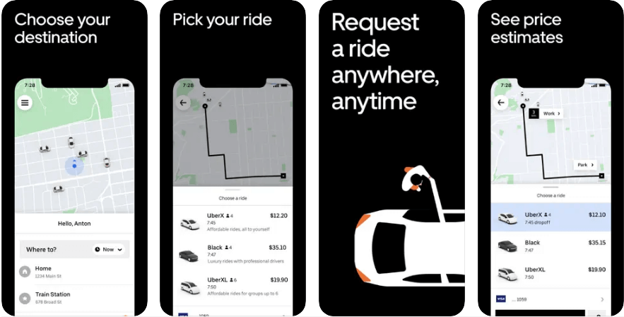
We have all used Uber and know how easy it is to use. With its interactive and bigger elements, Uber makes it easy for the user’s eye to understand actions.
All the destination results load quickly when you enter a destination name. It suggests the best options available for the cab.
You can keep a tab on the location of your cab during the trip or before the driver arrives while also using other apps.
With suchan intuitive interface and minimal design, Uber is customers’ favorite and is always improving.
2. Canva: Design, Photo & Video
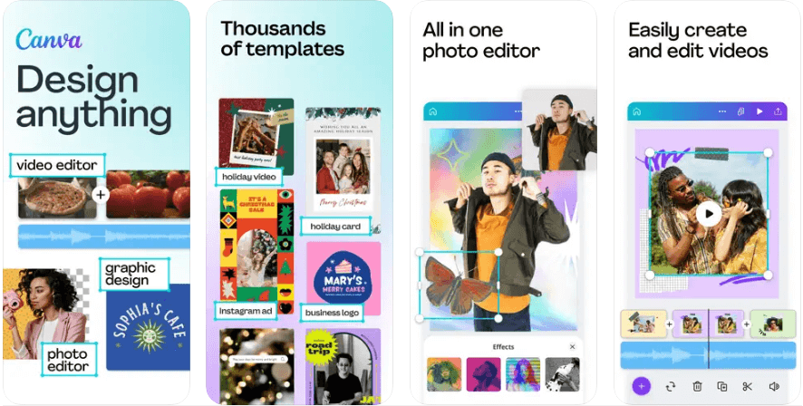
Canva is a design app that allows users to design amazing graphics with drag-and-drop functionality. Though it has a number of functionalities like adding elements, texts, photos, and much more, you can still see it run smoothly in the mobile app.
Its mobile app has mostly three colors i.e. blue, white, and black. The app design is intuitive and can be easily used by any beginner as well as a pro designer.
It has used the right amount of gestures for all its features like pinching, tapping, zooming, swiping, scrolling, etc.
3. AirBnB
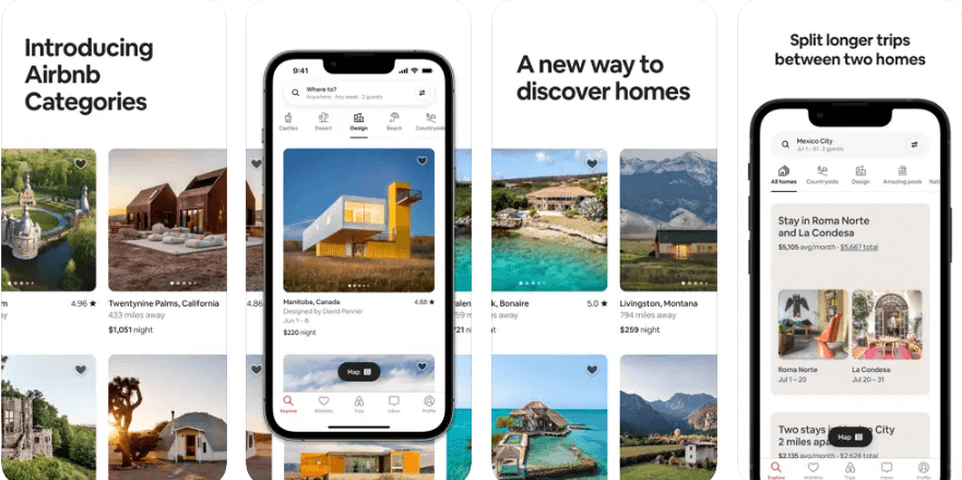
Having a presence in more than 190 countries, Airbnb has to connect with people of different cultures, ethnicities, and locations.
With such a vast user base, it has to make sure the app speed runs well with so many people operating it, as it consists of complicated features as well.
The company has to set UI/UX according to different geographical areas, with language, themes, etc. However, it has managed to market itself well with its best app interface design.
4. Coursera: Learn career skills
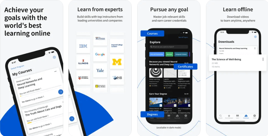
It is an e-learning app providing various vocational courses for different industries like engineering, humanities, IT, etc. With 1000+ courses, it still makes it easy for its users to navigate through its mobile app with intuitive UI/UX.
Various features can be accessed easily within the mobile app. Also, it has a simple signup system, and the consistency of design throughout the app makes it look really attractive to use.
5. Starbucks
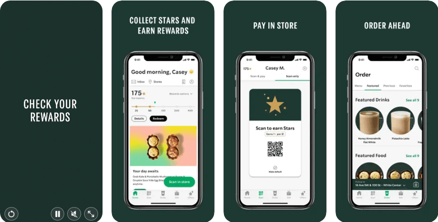
Starbucks has not only aced at its coffee and beverages but also in app design for mobile for its users.
The app makes sure that its users get what they want with ease. With simple yet attractive looks and designs, Starbucks allows users to order their favorite food and beverage. It has a sticky top and bottom showing all the item details of your order so that users can keep track of what they wanted.
List of Best Tools for Mobile App Design
With so many mobile app design tools in the market, it becomes hectic to choose the one that fits perfectly for your needs perfectly. Since we are an experienced mobile app design company, we know what tools work best. We have taken the initiative and have curated a list of the best tools for mobile app UI/UX design for you. They are:
- Figma
- Sketch
- Mockplus
- Invision
- Marvel
- Adobe XD
- Proto.io
- Justinmind
- Fluid UI
- Zeplin
Conclusion
For best app design practices, when hiring UI/UX designers, look for an expert with knowledge of the latest trends and elements. Mobile app designing is one the most important parts of any mobile app development process.
A good mobile application design not only makes a user stick to the app, but also uses it again now and then as well as suggests it to others. With so much advancement in technology, designing can be extremely creative and appealing to users. This can be seen in the latest apps launched, be it gaming apps or business apps, and the most appealing and inspiring are stock trading apps.
You can Hire Dedicated Web & Graphics Designers in India with the exact skills needed for excellent app design from top UI/UX design Company. Concetto Labs has a team of experts, be it in development, designing, or any other development process. We strive to provide the best results to our clients with constant efforts to make the best projects. Contact our team to get your project started with the most experienced team now.
Frequently Asked Questions
Here are some frequently asked questions about employing our developers that may help you.





 Indonesia
 Botswana
 USA
USA
 Italy
Italy
 Panama


 USA
USA UK
UK Saudi Arabia
 Norway
 India
India Australia